Iceberg publishing is a better way of structuring websites.
This article will show why most brands should rethink their website structure.
As a digital strategist, I’ve helped many brands convert to iceberg publishing, which focuses less on one single front page and instead strives to construct a website with “a thousand front pages.”
Here we go:
Iceberg Publishing
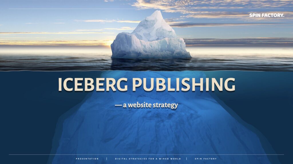
You could think of your website as an iceberg.
A characteristic of an iceberg is that whatever you see of the iceberg floating above the surface, you can be sure that the iceberg is many times larger underneath the surface.
“Typically about one-tenth of the volume of an iceberg is above water, which follows from Archimedes’s Principle of buoyancy; the density of pure ice is about 920 kg/m3 (57 lb/cu ft), and that of seawater about 1,025 kg/m3 (64 lb/cu ft). The contour of the underwater portion can be difficult to judge by looking at the portion above the surface.”
Source: Wikipedia
So, “above the surface” is where some of your pages are easily accessible from your site navigation (menu links, footer links, sidebar links, etc.). And then, “beneath the surface”, you place a vast array of web pages not directly linked to your navigation — landing pages.
Iceberg publishing has five key components:
The way to think about iceberg publishing is to imagine building a website where intent-driven and highly converting landing pages vastly outnumber basic and conventional web pages.
Learn more: Iceberg Publishing
What is a Landing Page?
What is a landing page?
Landing page (LP) = a single-purpose web page stripped of standard menus and sidebars with a single CTA (call-to-action) chosen to match the visitor’s demonstrated intent.
Why do landing pages work well?
A landing page is typically a web page with one singular call-to-action — or the same call-to-action repeated vertically. To maximise conversions, these pages are often stripped of sidebars, navigational menus, footers, etc.
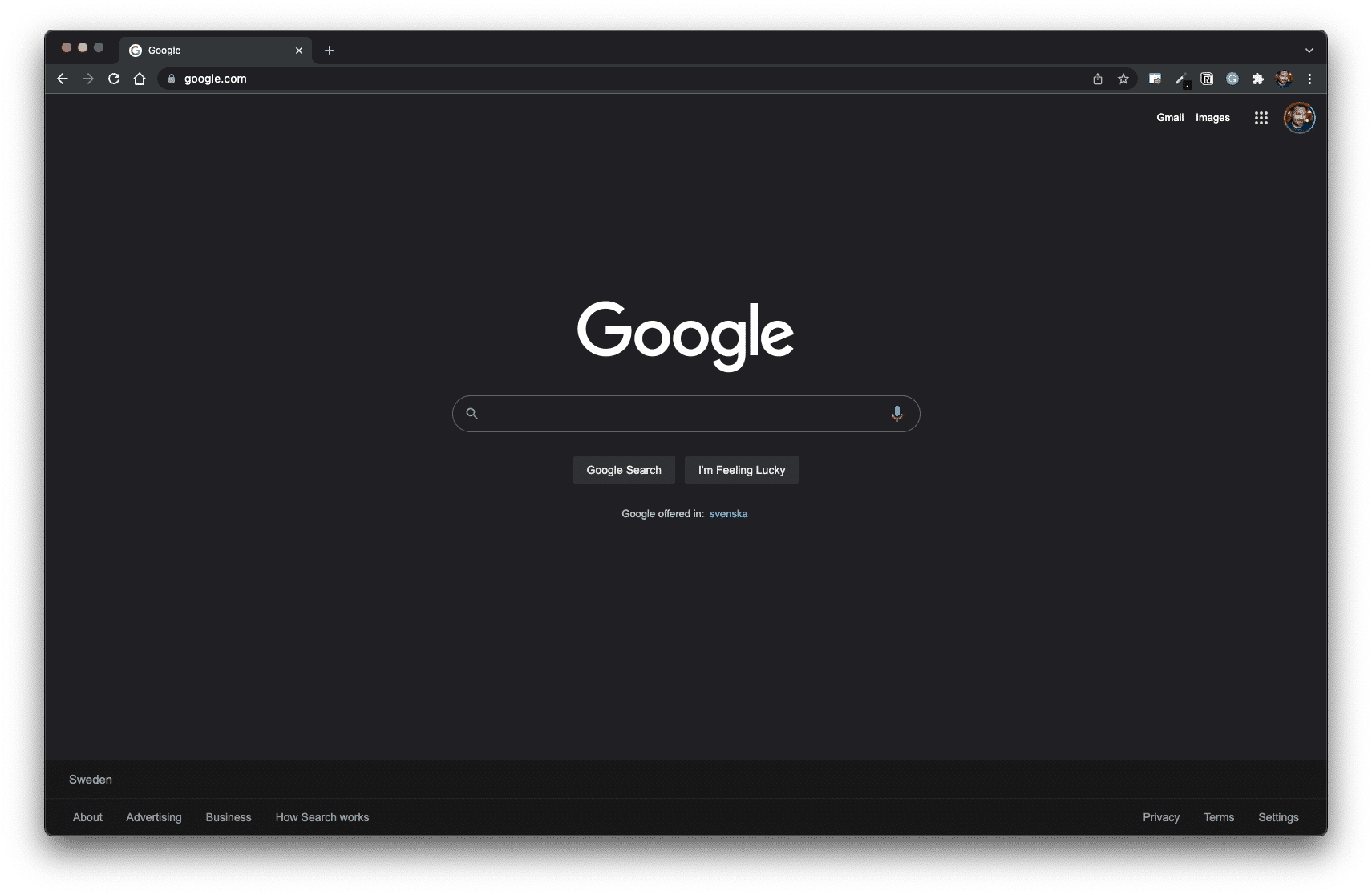
For intent-driven and clear call-to-action inspiration, please study how Google uses their front page as a clean, high-converting landing page.
Learn more: What is a Landing Page?
Types of Landing Pages
Here are a few examples of different landing page types:
Each landing page type serves a specific purpose in the customer journey, focusing on a single objective: increasing conversions by harvesting demonstrated user intent.
Only your imagination will determine what types of efficient landing pages you can develop!
Read also: Types of Landing Pages
Examples of Landing Pages
Here are some examples of landing page types:
Event Landing Pages
When to use:
When I talk at events, people ask if they can get hold of the slides I’ve just shown.
Still, many years of experience have gone into manifesting the knowledge I share. I think it’s only fair that I get something extra for sharing my presentation, right?
So, instead of just sending over a file with my presentation to the coördinator, I end my seminar with a link to a landing page where the audience can opt-in to download my presentation.
This way, the audience gets access to my presentation instantly afterwards, and I get a chance to nurture the new relationship digitally. At this point, I think I’ve created 35 event landing pages. The conversion rates on these pages are often between 70% and 90%.
Thank-You Landing Pages
When to use:
Every web page needs a thank-you landing page, and most brands need several different thank-you landing pages.
About Landing Pages
When to use:
Most websites have at least one About page. Despite often being quite dull, these pages are often relatively well-visited. Therefore, it makes sense to transform your about-pages into landing pages.
Content Theme Landing Pages
When to use:
Brands focused on online content often concentrate their efforts on content themes. Once such a period is completed, creating separate content theme landing pages often makes sense.
Resource Landing Pages
When to use:
Brands focused on inbound communications often generate deep content, such as downloadable assets, lead magnets, content upgrades, infographics, templates, swipe files, etc. All such resources warrant their resource landing pages.
Form Landing Pages
When to use:
Instead of embedding your forms directly into a standard web page, it’s often better to use a button and point to forms embedded on form landing pages instead.
FAQ Landing Pages
When to use:
Many businesses get the same questions repeatedly, and for this reason, many companies use FAQ sections. One trick is to keep each answer in your FAQ very short and finish each reply with a Read More link. These links could then refer to many different FAQ landing pages.
Automation Landing Pages
When to use:
A brand could make good use of various online automation. It could be a short series of emails like a mini-course or a viral loop with a sequence of videos. These types of pages spell good opportunities for creating automation landing pages.
Disclaimer Landing Pages
When to use:
Most brands use different kinds of disclaimers, which are typically dull. With some creative thinking, these disclaimers could be converted into disclaimer landing pages.
Intent Landing Pages
When to use:
Think about this: Where can a visitor click a link on the web and end up on your website? Suppose you know of such links, which can often be easily identified by tracking external referrers in analytics. You can set up intent landing pages to better serve (and convert) inbound audiences.
Learn more: Types of Landing Pages
Evergreen Content
What’s evergreen content?
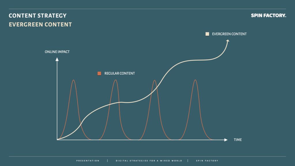
Evergreen content is an inbound approach to building core messages, content themes, content packages, deep content, and content skyscrapers.
For a piece of content to be evergreen, it must sustain its value over time. This means the content must be relevant today, tomorrow, and the foreseeable future.
While news content might make a more significant short-term splash, evergreen content accumulates online impact over time—which requires patience.
Now, forever is a long time. I typically apply these arbitrary rules to determine what constitutes evergreen content:
Learn more: The Evergreen Content PR Strategy
Content Themes
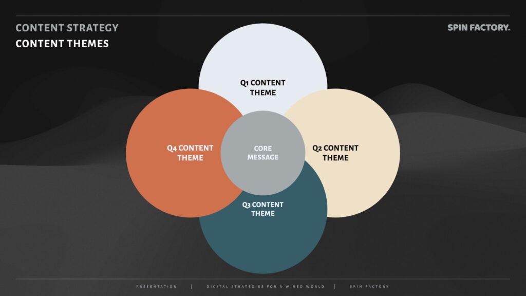
It is good practice to structure the content calendar around content themes (typically four per year, one per quarter) showcasing varying aspects of the organisation’s core message.
Using content themes comes with several upsides:
For easy planning and boosting SEO with content skyscrapers, I often create content packages for each theme.
Content Themes Example
Let’s use a fictitious example of an IT company.
First, the IT company decide on a core message for their content strategy:
Core message: We make IT easy to understand.
Then, the IT company breaks their core message down into four business-critical content themes:
Q1 content theme: We make people understand the Internet of Things (IoT).
Q2 content theme: We make people understand business automation.
Q3 content theme: We make people understand cloud computing.
Q4 content theme: We make people understand managed services.
Learn more: The Content Themes PR Strategy
Deep Content
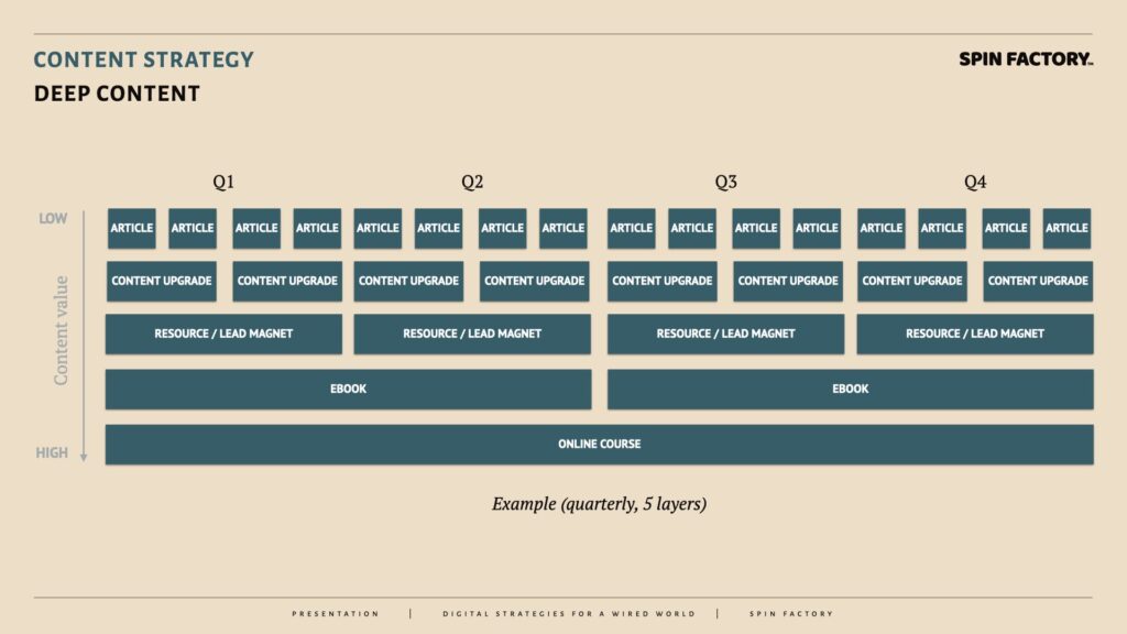
Deep content is focused on providing increasingly higher-quality information to content divers (as opposed to content surfers).
In the example, five layers of evergreen content are stacked vertically on a quarterly timeline:
Example of a five-layer deep content structure:
This inbound logic is similar to iceberg publishing and content themes regarding structure and depth.
Learn more: The Deep Content PR Strategy
The Inbound Shift
As public relations professionals, we must rethink how we think about publics. Traditionally, many PR departments have argued:
“Why should we waste budgets on ‘already acquired’ audiences?”
The truth is — it’s the other way around.
The inbound shift is a fundamental mindset change in the public relations industry.

Instead of “spamming” non-existing audiences, public relations and marketing can do much more with existing online publics. 2Silfwer, J. (2015, June 11). The Publics in Public Relations. Doctor Spin | The PR Blog. https://doctorspin.net/publics-in-public-relations/
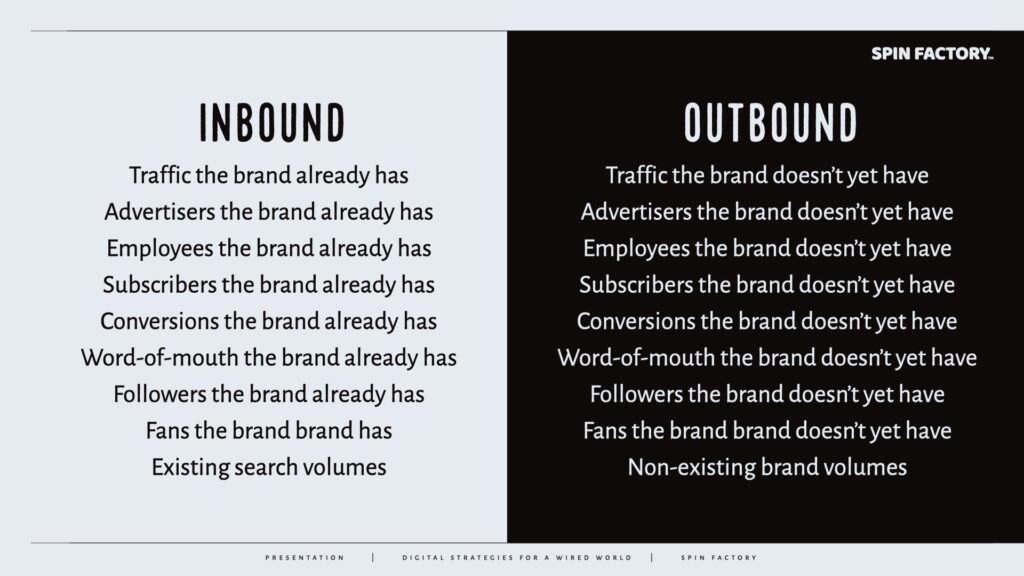
Inbound vs Outbound: The Difference
Inbound vs outbound is the online equivalent of drawing the line between those who know you and those who don’t.
Drawing a line between those who know you and those who don’t know you is nothing new:
If your inbound shift PR strategy is strong, you might no longer need to prioritise your outbound PR strategies since your inbound audience will attract outbound publics!
Learn more: The Inbound Shift PR Strategy
How To Use Iceberg Publishing
Iceberg publishing rests on three basic principles:
When someone clicks a link on or outside of your website, they demonstrate their exact intent through their action. Therefore, you should remove all distractions on the link target.
There should always be something for the visitor to do next, i.e., a call to action. The idea is that the website should always offer the possibility to go deeper into it.
A good rule of thumb is to have more landing pages than navigational pages (minus blog articles or wiki-style entries) to maximise usability, SEO, and conversions.
There are many benefits of using iceberg publishing:

THANKS FOR READING.
Need PR help? Hire me here.

What should you study next?
Spin Academy | Online PR Courses
Spin’s PR School: Free Web Strategy PR Course
Get started with this free Web Strategy PR Course and learn essential public relations strategies and concepts for online PR success.
Iceberg Publishing
Conversion Design
Website Psychology
Learn more: All Free PR Courses
💡 Subscribe and get a free ebook on how to get better PR.

Annotations
| 1 | Silfwer, J. (2015, October 4). Beware of Conversion Cannibalism. Doctor Spin | The PR Blog. https://doctorspin.net/conversion-cannibalism/ |
|---|---|
| 2 | Silfwer, J. (2015, June 11). The Publics in Public Relations. Doctor Spin | The PR Blog. https://doctorspin.net/publics-in-public-relations/ |

