I often confront clients in the classic home page debate.
Most organisations put too much content on their home pages. Due to the paradox of choice, this practice hurts their conversions and, by extension, their business objectives.
Here we go:
The Classic Home Page Debate
“We must put all these items on our home page because they’re all important to us.”
I often get involved in heated debates on what to include on the home page. If I weigh into the debate that they should remove certain elements, the chances are that someone will get offended.
Like, “How dare you suggest that my work function be removed from our home page?”
The Google Home Page
Take a look at Google’s home page:
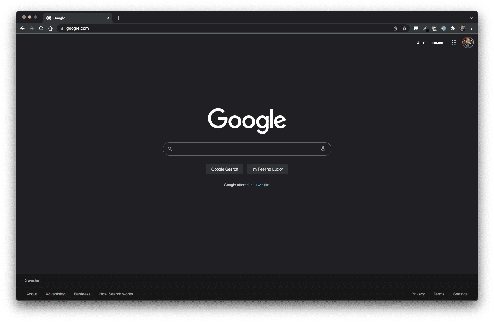
Now, Google has many products that are arguably important to their business model.
To name a few examples:
All these Google products are reasonably significant, right? However, they still don’t replace Google’s de facto home page — the Google Search page (designed to be a landing page).
It begs the question:
If Google can keep its home page clean, why can’t you?
Small Ask vs Big Ask
The key to an efficient home page design is to stop thinking about what’s “important” and “not important”.
Think instead of how to create a “yes ladder” by starting with a “small ask” and, through iceberg publishing, work your way up to a “big ask.”
Small ask = a value proposition that requires little effort and resources for a prospect to accept. It works best when the ask offers a swift, hassle-free solution for an urgent pain point.
Big ask = a value proposition that requires high engagement and a substantial transaction by the prospect. It works best when mutual understanding and trust are thoroughly established.
By prioritising a small ask on the home page design, you increase the likelihood of building such a “yes ladder” by gently priming your user to “yes” over time.
Learn more: The Classic Home Page Debate
Conversion Cannibalism
Imagine a web page with one button for users to click. Let’s say the button generates 10 clicks.
So, what if you add another button?
Will you now get 10 + 10 clicks?
Typically, no.
In most cases, you won’t even get to keep your initial 10 clicks. You might get 5 clicks in total and thus lose half of your engagement by adding another choice.
This is conversion cannibalism.
The Paradox of Choice
In 1995, Professor Shena Iyengar from Columbia University launched a market stall with different jam flavours. When she offered twenty-four options, more people came to the booth. When she only offered six choices, more people converted into paying customers.
Our decision-making process is complex, but researchers have offered many possible explanations, such as decision fatigue, analysis paralysis, and buyer’s remorse. 1Piasecki, M., & Hanna, S. (2011). A Redefinition of the Paradox of Choice. , 347 – 366. https://doi.org/10.1007/978 – 94-007‑0510-4_19
Buttons and forms on a website are subject to the paradox of choice.
Horizontal vs Vertical Design
On the web today, we see a trend where there is white space to both the left and right of buttons and forms. We also see a trend where more of the same CTAs are stacked from top to bottom.
Why is this a design trend?
The minority who click your content’s call to action (content diver = moving vertically) is exponentially more valuable than the majority who scan and move along (content surfer = moving horizontally).
The strategic placing of CTAs and visual elements should, therefore, be considered when designing a web page:
Learn more: Beware of Conversion Cannibalism
Thanks for reading. Need a PR specialist?
Please contact Jerry for a consultation.
What should you study next?
Spin Academy | Online PR Courses
Spin’s PR School: Free Web Strategy PR Course
Get started with this free Web Strategy PR Course and learn essential public relations strategies and concepts for online PR success.
Iceberg Publishing
Conversion Design
Website Psychology
Learn more: All Free PR Courses
💡 Subscribe and get a free ebook on how to get better PR.
Annotations
| 1 | Piasecki, M., & Hanna, S. (2011). A Redefinition of the Paradox of Choice. , 347 – 366. https://doi.org/10.1007/978 – 94-007‑0510-4_19 |
|---|