Does your web design suffer from conversion cannibalism?
Organisations add CTAs frequently, hoping to increase conversions. They hope that 1+1=3, but in reality, it’s closer to 1+1=0.
Adding more CTAs (call-to-actions) to a single browser view will allow these buttons and forms to cannibalise each other’s conversion rates.
I will demonstrate why less is more in web design.
Here we go:
Conversion Cannibalism
Imagine a web page with one button for users to click. Let’s say the button generates 10 clicks.
So, what if you add another button?
Will you now get 10 + 10 clicks?
Typically, no.
In most cases, you won’t even get to keep your initial 10 clicks. You might get 5 clicks in total and thus lose half of your engagement by adding another choice.
This is conversion cannibalism.
The Paradox of Choice
In 1995, Professor Shena Iyengar from Columbia University launched a market stall with different jam flavours. When she offered twenty-four options, more people came to the booth. When she only offered six choices, more people converted into paying customers.
Our decision-making process is complex, but researchers have offered many possible explanations, such as decision fatigue, analysis paralysis, and buyer’s remorse. 1Piasecki, M., & Hanna, S. (2011). A Redefinition of the Paradox of Choice. , 347 – 366. https://doi.org/10.1007/978 – 94-007‑0510-4_19
Buttons and forms on a website are subject to the paradox of choice.
Horizontal vs Vertical Design
On the web today, we see a trend where there is white space to both the left and right of buttons and forms. We also see a trend where more of the same CTAs are stacked from top to bottom.
Why is this a design trend?
The minority who click your content’s call to action (content diver = moving vertically) is exponentially more valuable than the majority who scan and move along (content surfer = moving horizontally).
The strategic placing of CTAs and visual elements should, therefore, be considered when designing a web page:
Learn more: Beware of Conversion Cannibalism
The Classic Home Page Debate
“We must put all these items on our home page because they’re all important to us.”
I often get involved in heated debates on what to include on the home page. If I weigh into the debate that they should remove certain elements, the chances are that someone will get offended.
Like, “How dare you suggest that my work function be removed from our home page?”
The Google Home Page
Take a look at Google’s home page:
Now, Google has many products that are arguably important to their business model.
To name a few examples:
All these Google products are reasonably significant, right? However, they still don’t replace Google’s de facto home page — the Google Search page (designed to be a landing page).
It begs the question:
If Google can keep its home page clean, why can’t you?
Small Ask vs Big Ask
The key to an efficient home page design is to stop thinking about what’s “important” and “not important”.
Think instead of how to create a “yes ladder” by starting with a “small ask” and, through iceberg publishing, work your way up to a “big ask.”
Small ask = a value proposition that requires little effort and resources for a prospect to accept. It works best when the ask offers a swift, hassle-free solution for an urgent pain point.
Big ask = a value proposition that requires high engagement and a substantial transaction by the prospect. It works best when mutual understanding and trust are thoroughly established.
By prioritising a small ask on the home page design, you increase the likelihood of building such a “yes ladder” by gently priming your user to “yes” over time.
Learn more: The Classic Home Page Debate
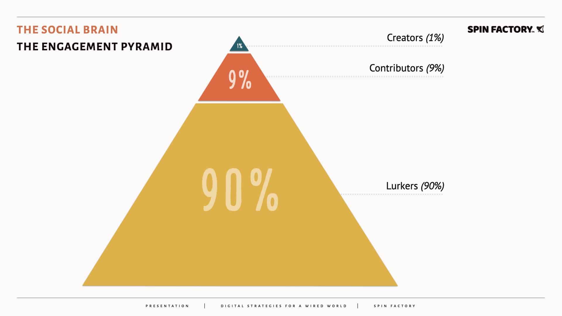
The Engagement Pyramid
The 1% rule of online engagement was mainly an urban legend on the internet. However, a peer-reviewed paper from 2014 confirmed the 1% rule of thumb. 2Trevor van Mierlo. (2014). The 1% Rule in Four Digital Health Social Networks: An Observational Study. Journal of Medical Internet Research, 16(2), e33 – e33. … Continue reading
Active publics distribute themselves in a way proven scientifically by sociologists — long before the internet and social media emerged.
The engagement pyramid divides publics into three distinct groups:
When studying internet forums specifically, it’s not uncommon to find that 90% of users have never posted (lurkers), 9% are adding only to existing topics and threads (contributors), and 1% are actively starting new subjects and threads (creators).
The engagement pyramid is sometimes called the 1% rule or the 90−9−1 principle.
“The 90−9−1 principle and Zipf’s Law both effectively classify members in online support groups, with the Zipf distribution accounting for 98.6% of the variance.”
Source: Internet Interventions 3Carron-Arthur, B., Cunningham, J., & Griffiths, K. (2014). Describing the distribution of engagement in an Internet support group by post frequency: A comparison of the 90−9−1 Principle and … Continue reading
Learn more: The Engagement Pyramid (The 90−9−1 Principle)
Priority: The Small Ask
The choice of what to put on the front page isn’t related to what’s necessary or not necessary. Instead, it should be regarded only as a point of entry into your brand’s universe.
Instead of cramming everything into one front page, your business could utilise multiple high-converting landing pages, a strategy I call iceberg publishing, where many hidden direct landing pages are beneath the site’s surface.
By making a small ask (your email address in exchange for something valuable to you) instead of a big ask (invest in hiring me as an advisor), I can capture and nurture trusting relationships over time, slowly moving prospects from 9% to 1%.
Looking back at the Google example, one could say they use multiple front pages. If we look at Google Drive’s “front page,” we can see the same strategy: just one message and one call-to-action above the fold. It works because it’s crystal clear:
More and more conversion experts argue that most pages within a website’s structure should be landing pages. Landing pages are accessible for search engines to drive relevant traffic since they’re stripped of unnecessary content.

THANKS FOR READING.
Need PR help? Hire me here.

What should you study next?
Spin Academy | Online PR Courses

Spin’s PR School: Free Web Strategy PR Course
Get started with this free Web Strategy PR Course and learn essential public relations strategies and concepts for online PR success.
Iceberg Publishing
Conversion Design
Website Psychology
Learn more: All Free PR Courses
💡 Subscribe and get a free ebook on how to get better PR.
Annotations
| 1 | Piasecki, M., & Hanna, S. (2011). A Redefinition of the Paradox of Choice. , 347 – 366. https://doi.org/10.1007/978 – 94-007‑0510-4_19 |
|---|---|
| 2 | Trevor van Mierlo. (2014). The 1% Rule in Four Digital Health Social Networks: An Observational Study. Journal of Medical Internet Research, 16(2), e33 – e33. https://doi.org/10.2196/jmir.2966 |
| 3 | Carron-Arthur, B., Cunningham, J., & Griffiths, K. (2014). Describing the distribution of engagement in an Internet support group by post frequency: A comparison of the 90−9−1 Principle and Zipf’s Law. Internet Interventions, 1, 165 – 168. https://doi.org/10.1016/J.INVENT.2014.09.003 |
