There are many types of landing pages.
Contrary to popular belief, landing pages aren’t synonymous with “all pages where users happen to land.”
A landing page is a single-purpose web page stripped of standard menus and sidebars with a single CTA (call-to-action) chosen to match the visitor’s demonstrated intent.
Landing page (LP) = a single-purpose web page stripped of standard menus and sidebars with a single CTA (call-to-action) chosen to match the visitor’s demonstrated intent.
There are many different kinds of landing pages.
Here we go:
Types of Landing Pages
Here are a few examples of different landing page types:
Each landing page type serves a specific purpose in the customer journey, focusing on a single objective: increasing conversions by harvesting demonstrated user intent.
Only your imagination will determine what types of efficient landing pages you can develop!
Read also: Types of Landing Pages
Examples of Landing Pages
Here are some examples of landing page types:
Event Landing Pages
When to use:
When I talk at events, people ask if they can get hold of the slides I’ve just shown.
Still, many years of experience have gone into manifesting the knowledge I share. I think it’s only fair that I get something extra for sharing my presentation, right?
So, instead of just sending over a file with my presentation to the coördinator, I end my seminar with a link to a landing page where the audience can opt-in to download my presentation.
This way, the audience gets access to my presentation instantly afterwards, and I get a chance to nurture the new relationship digitally. At this point, I think I’ve created 35 event landing pages. The conversion rates on these pages are often between 70% and 90%.
Thank-You Landing Pages
When to use:
Every web page needs a thank-you landing page, and most brands need several different thank-you landing pages.
About Landing Pages
When to use:
Most websites have at least one About page. Despite often being quite dull, these pages are often relatively well-visited. Therefore, it makes sense to transform your about-pages into landing pages.
Content Theme Landing Pages
When to use:
Brands focused on online content often concentrate their efforts on content themes. Once such a period is completed, creating separate content theme landing pages often makes sense.
Resource Landing Pages
When to use:
Brands focused on inbound communications often generate deep content, such as downloadable assets, lead magnets, content upgrades, infographics, templates, swipe files, etc. All such resources warrant their resource landing pages.
Form Landing Pages
When to use:
Instead of embedding your forms directly into a standard web page, it’s often better to use a button and point to forms embedded on form landing pages instead.
FAQ Landing Pages
When to use:
Many businesses get the same questions repeatedly, and for this reason, many companies use FAQ sections. One trick is to keep each answer in your FAQ very short and finish each reply with a Read More link. These links could then refer to many different FAQ landing pages.
Automation Landing Pages
When to use:
A brand could make good use of various online automation. It could be a short series of emails like a mini-course or a viral loop with a sequence of videos. These types of pages spell good opportunities for creating automation landing pages.
Disclaimer Landing Pages
When to use:
Most brands use different kinds of disclaimers, which are typically dull. With some creative thinking, these disclaimers could be converted into disclaimer landing pages.
Intent Landing Pages
When to use:
Think about this: Where can a visitor click a link on the web and end up on your website? Suppose you know of such links, which can often be easily identified by tracking external referrers in analytics. You can set up intent landing pages to better serve (and convert) inbound audiences.
Learn more: Types of Landing Pages
Conversion Cannibalism
Imagine a web page with one button for users to click. Let’s say the button generates 10 clicks.
So, what if you add another button?
Will you now get 10 + 10 clicks?
Typically, no.
In most cases, you won’t even get to keep your initial 10 clicks. You might get 5 clicks in total and thus lose half of your engagement by adding another choice.
This is conversion cannibalism.
The Paradox of Choice
In 1995, Professor Shena Iyengar from Columbia University launched a market stall with different jam flavours. When she offered twenty-four options, more people came to the booth. When she only offered six choices, more people converted into paying customers.
Our decision-making process is complex, but researchers have offered many possible explanations, such as decision fatigue, analysis paralysis, and buyer’s remorse. 1Piasecki, M., & Hanna, S. (2011). A Redefinition of the Paradox of Choice. , 347 – 366. https://doi.org/10.1007/978 – 94-007‑0510-4_19
Buttons and forms on a website are subject to the paradox of choice.
Horizontal vs Vertical Design
On the web today, we see a trend where there is white space to both the left and right of buttons and forms. We also see a trend where more of the same CTAs are stacked from top to bottom.
Why is this a design trend?
The minority who click your content’s call to action (content diver = moving vertically) is exponentially more valuable than the majority who scan and move along (content surfer = moving horizontally).
The strategic placing of CTAs and visual elements should, therefore, be considered when designing a web page:
Learn more: Beware of Conversion Cannibalism
The Classic Home Page Debate
“We must put all these items on our home page because they’re all important to us.”
I often get involved in heated debates on what to include on the home page. If I weigh into the debate that they should remove certain elements, the chances are that someone will get offended.
Like, “How dare you suggest that my work function be removed from our home page?”
The Google Home Page
Take a look at Google’s home page:
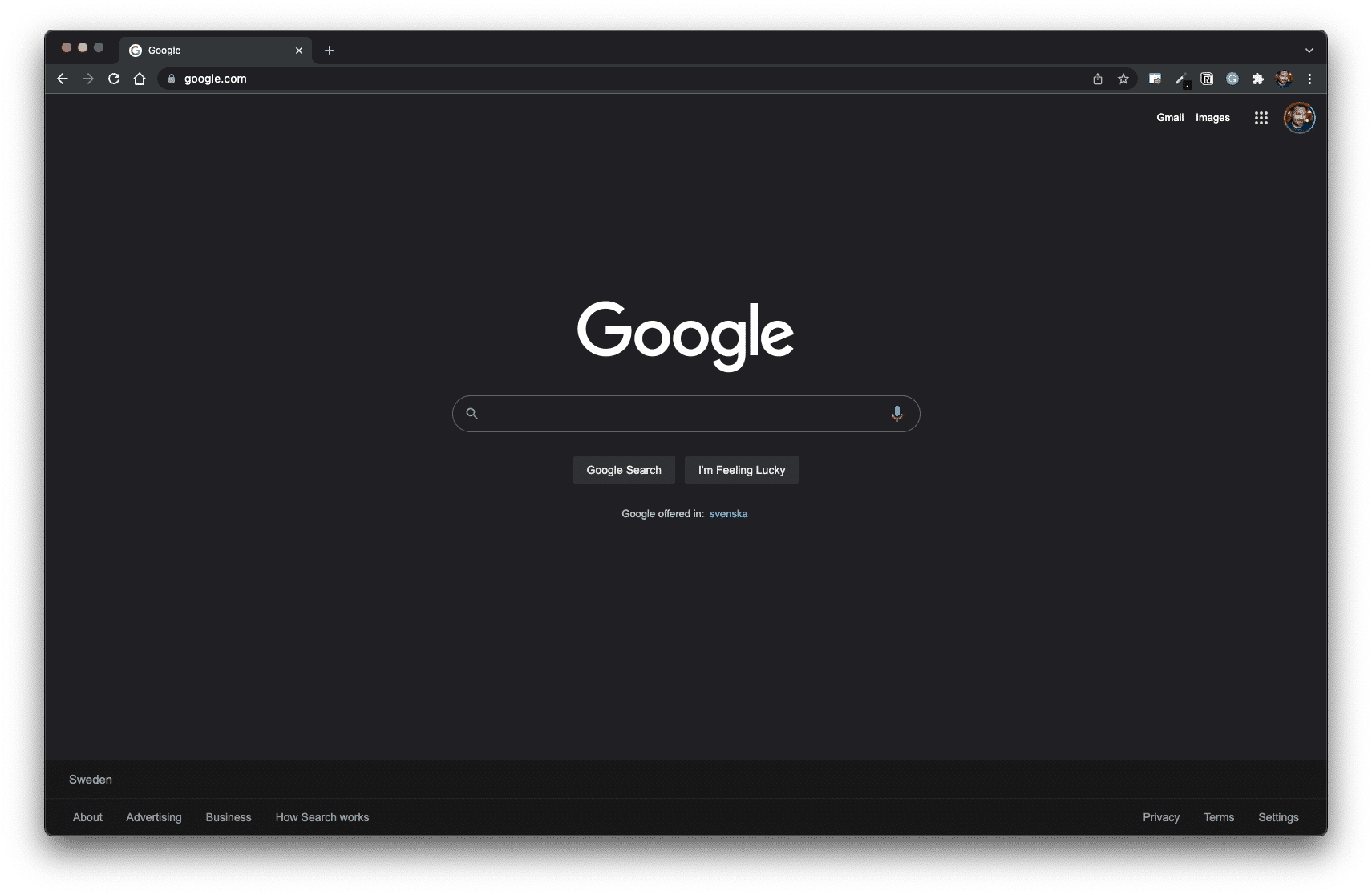
Now, Google has many products that are arguably important to their business model.
To name a few examples:
All these Google products are reasonably significant, right? However, they still don’t replace Google’s de facto home page — the Google Search page (designed to be a landing page).
It begs the question:
If Google can keep its home page clean, why can’t you?
Small Ask vs Big Ask
The key to an efficient home page design is to stop thinking about what’s “important” and “not important”.
Think instead of how to create a “yes ladder” by starting with a “small ask” and, through iceberg publishing, work your way up to a “big ask.”
Small ask = a value proposition that requires little effort and resources for a prospect to accept. It works best when the ask offers a swift, hassle-free solution for an urgent pain point.
Big ask = a value proposition that requires high engagement and a substantial transaction by the prospect. It works best when mutual understanding and trust are thoroughly established.
By prioritising a small ask on the home page design, you increase the likelihood of building such a “yes ladder” by gently priming your user to “yes” over time.
Learn more: The Classic Home Page Debate

THANKS FOR READING.
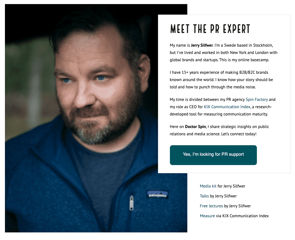
Need PR help? Hire me here.

What should you study next?
Spin Academy | Online PR Courses
Spin’s PR School: Free Web Strategy PR Course
Get started with this free Web Strategy PR Course and learn essential public relations strategies and concepts for online PR success.
Iceberg Publishing
Conversion Design
Website Psychology
Learn more: All Free PR Courses
💡 Subscribe and get a free ebook on how to get better PR.
Annotations
| 1 | Piasecki, M., & Hanna, S. (2011). A Redefinition of the Paradox of Choice. , 347 – 366. https://doi.org/10.1007/978 – 94-007‑0510-4_19 |
|---|